기본적인 python 개념을 알고 있다는 전제 하,
라이브러리들을 간단하게 사용하는 것들 위주로 기억하기 위해 작성하는 글임을 참고 부탁드립니다
Pandas : 데이터 프레임 읽기

pandas로 파일 어떻게 읽나요?
개인 data/track_XY.txt 를 사용. ( 깃허브에 있긴한데 추후 공개. 당장은 비슷하게 생긴놈 찾으면 되겠읍니다 )
마지막에 요약으로 프린트해줘서 결과까지 확인한다.
| , |
표준 |
| \t | tab |
| \s+ | 하나 이상의 공백 |
| '' | txt 파일에서 주로 사용 |
| r'\s+' | column이 space로 구분되어 있는 경우 |
import pandas as pd

# 파일 읽기
track_data = "data/track_XY.txt"
df = pd.read_table(track_data,
                   sep="\s+",                                      # 구분자
                   # , 표준 | \t tab | \s+ 하나 이상의 공백 | ' ' txt파일에서 주로 사용
                   encoding="euc-kr",                              # 인코딩 타입
                   names=['longitude', 'latitude'],                # 컬럼명
                   dtype={'longitude': float, 'latitude': float})  # 컬럼 데이터 타입

# 전체 평균, 최대, 최소 계산
summary = df.agg(['mean', 'max', 'min'])

# 결과 출력
print(summary)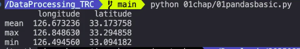
pandas로 파일 저장 어떻게?
기존 euc-kr 은 8비트 문자 인코딩이고 대표적인 한글 완성형 인코딩이라 하지만 최근은 또 바뀌어 utf-8로 변경.
utf-8-sig 인코딩을 사용하여 BOM(Byte Order Mark)을 포함할 수도 있음. (뭐 크게 상관은 없다)
- 여기서 index = 행수 (0,1,2) column = header True / False로 표시 합니다.
- na_rep : 결측치가 있을경우 ‘NaN’으로 표시 한다는 뜻
def write_pandas():
    friend_ordered_dict = OrderedDict([
        ('name',['John','Peter','pi']),
        ('age',[25,30,40]),
        ('weight',[75.3, 64.5, 3.141592653]),
        ('job',['student','연구원','교수']),
    ])

    df = pd.DataFrame.from_dict(friend_ordered_dict)
    df.to_csv("data/save1.csv",
              encoding="utf-8",
              sep=' ',
              na_rep='NaN',
              float_format='%.2f', # 2 decimal places
              index=False,
              header=True)
    # 인코딩을 UTF-8로 변경하고 index (0,1,2) 제거
Numpy : 계산 잘하는 놈
vector연산.
array 단위로 데이터를 관리하고 matrix 계산.
- Powerful N-dimensional array
- Numerical Computing Tools
- Performance
간단하게 perplexity한테 부탁해서 많이 쓰는 코드를 받았다.
코드에 있는 것 처럼 배열연산, 다차원 배열, 수학 함수 위주로 사용한다.
import numpy as np

# 배열 생성
arr1 = np.array([1, 2, 3, 4, 5])
arr2 = np.zeros((3, 3))
arr3 = np.ones((2, 2))
arr4 = np.arange(0, 10, 2)

# 배열 연산
result = arr1 + 5
squared = np.square(arr1)
sum_arr = np.sum(arr1)
mean_arr = np.mean(arr1)

# 배열 형태 변경
reshaped = arr1.reshape((5, 1))

# 난수 생성
random_arr = np.random.rand(3, 3)

# 배열 인덱싱
slice_arr = arr1[1:4]

print("Original array:", arr1)
print("Array + 5:", result)
print("Squared array:", squared)
print("Sum of array:", sum_arr)
print("Mean of array:", mean_arr)
print("Reshaped array:\n", reshaped)
print("Random array:\n", random_arr)
print("Sliced array:", slice_arr)
Matplotlib : 시각화 툴
- 시각화 툴.
- basemap도 maplotlib 중 하나
def draw_graph():
    x = np.arange(1, 10)
    y = x * 3

    # 3가지 산점도
    plt.scatter(x, y, color='blue', marker='+', s=100)  # s = 마커 크기
    plt.plot(x, y-2, linestyle=":",
             color='blue',
             marker='o',
             markeredgecolor='g',
             markerfacecolor='r'
             )
    plt.plot(x, y-5, linestyle="--",
             color='black',
             marker='s',
             markeredgecolor='m',
             markerfacecolor='c'
             )

    plt.show()

def color_graph():
    cmaps = plt.colormaps()  # Matplotlib에서 지원하는 모든 색상표 가져오기
    for cmap in cmaps:       # 리스트를 반복
        print(cmap)

    data = np.random.rand(10, 10)  # 예시 데이터 생성

    plt.imshow(data, cmap='viridis')  # 출력
    plt.colorbar()
    plt.title('Example with Viridis Colormap')
    plt.show()

기타 설정 방법
- 가로 격자선 plt.axhline(y=2000, color=’r’, linewidth=1) # y축 2000 에 붉은색라인
- 세로 격자선 plt.axvline(x=datetime(2016, 2, 17), color=’r’, linestyle=’- -’, linewidth=3)
- 실선 ‘-’, ‘solid’
- 파선 ‘- -’, ‘dashed’
- 1점 쇄선 ‘-.’, ‘dashdot’
- 점선 ‘:’, ‘dotted’
- 안그림 ‘’, ‘ ‘
plt.subplot(row, column, index) (세로길이, 가로길이, 인덱스)
https://kongdols-room.tistory.com/98
def sub_graph():
    x1 = np.linspace(0.0, 5.0)
    x2 = np.linspace(0.0, 2.0)

    y1 = np.cos(2 * np.pi * x1) * np.exp(-x1)
    y2 = np.cos(2 * np.pi * x2)

    ax1 = plt.subplot(2, 1, 1)
    plt.plot(x1, y1, 'o-')
    plt.title('1st Graph')
    plt.ylabel('Damped oscillation')

    #plt.xticks(visible = False) # Hide x-ticks and labels
    ax2 = plt.subplot(2, 1, 2, sharex=ax1)  # Sharing x-axis with ax1
    plt.plot(x2, y2, '.-')
    plt.title('2nd Graph')
    plt.xlabel('time (s)')
    plt.ylabel('undamped')
    plt.tight_layout()  # Adjust layout to prevent overlap
    plt.show()
plt.subplot2grid((전체크기), (행, 열), (행열방향으로 크기))
def grid_graph():
    plt.figure(figsize=(10, 12))
    ax1 = plt.subplot2grid((3,3), (0,0), colspan=3)
    ax2 = plt.subplot2grid((3,3), (1,0), colspan=2)
    ax3 = plt.subplot2grid((3,3), (1,2), rowspan=2)
    ax4 = plt.subplot2grid((3,3), (2,0))
    ax5 = plt.subplot2grid((3,3), (2,1))
    plt.show()
범례 legend 설정
plt.legend(handles = [ variable_x, variable_y, variable_z ],  # 표시할 객체들리스트
                      loc = ‘best’,     # 위치 지정. upper left, upper right, lower left, center left
                      frameon = True,   # 범례 주위 테두리 프레임.
                      fontsize = 10,
                      facecolor = ‘lightgrey’,  # 범례의 배경 색상
                      labelcoor = ‘black’)
+ Histogram
Hisogram 개념과 응용
- count 16.000000
mean 3.593750
std 1.280869
min 1.000000
25% 2.875000
50% 4.000000
75% 5.000000
max 5.000000
Name: values, dtype: float64
def histogram():
    data = {'values' : [1, 2, 2, 2.5, 3, 3, 3, 4, 4, 4, 4, 5, 5, 5, 5, 5]}
    df = pd.DataFrame(data)
    # make histogram
    plt.hist(df['values'], color= 'y', edgecolor = 'white', alpha = 0.7, bins = 5)
    # 색, 투명도, 경계, 구간 지정 (0.7씩 5개로 표현)
    plt.title('Histogram Example')
    plt.xlabel('Values')
    plt.ylabel('Counts')

    print(df['values'].describe())
    plt.show()
histogram 구간에 대한 이해
counts, bins, patches
각 구간 데이터 개수, 구간 경계값 정의, 히스토그램 막대에 대한 객체 리스트
최솟값, 최댓값 +간격 , 간격씩
def histogram2():
    data = np.random.normal(7, 3, 100)

    # 각 구간 데이터 개수, 구간 경계값 정의, 히스토그램 막대에 대한 객체 리스트
    bin_interval = 2
    #counts, bins, patches = plt.hist(data, bins=[0,3,6,9,12,15], edgecolor = 'black')
    counts, bins, patches = plt.hist(data,
                                     bins=np.arange(min(data), max(data) + bin_interval, bin_interval),
                                     edgecolor = 'black')
    plt.xlabel("bins", fontsize = 12)
    plt.ylabel("count", fontsize = 12)

    for i in range(len(counts)):
        print(f"구간 {bins[i]:.2f}{bins[i+1]:.2f}: {counts[i]}개")

    plt.tight_layout()
    plt.show()
+ numpy ceil, floor 소숫점 올림과 내림 / min, max 이용
def mathwithhist():
    data = np.random.normal(7, 3, 100)

    # data point 에 대한 내림, 올림 계산 / min, max 계산
    floored_data = np.floor(data)
    ceiled_data = np.ceil(data)
    min_val = np.min(floored_data)
    max_val = np.max(ceiled_data)

    bin_interval = 2
    #counts, bins, patches = plt.hist(data, bins=[0,3,6,9,12,15], edgecolor = 'black')
    counts, bins, patches = plt.hist(data,
                                     bins=np.arange(min_val, max_val + bin_interval, bin_interval),
                                     edgecolor = 'black')
    plt.xlabel("bins", fontsize = 12)
    plt.ylabel("count", fontsize = 12)
    plt.grid(True) # add grid line

    for i in range(len(counts)):
        print(f"구간 {bins[i]:.2f}{bins[i+1]:.2f}: {counts[i]}개")

    plt.tight_layout()
    plt.show()
추가 참고 링크
subplot 인자, 옵션들 상세 사항 https://kongdols-room.tistory.com/98
'Data Engineering 재밌따 > Python basic for data' 카테고리의 다른 글
| 간단한 파이썬 - 위경도 변환하기 (1) | 2024.12.03 |
|---|
